Tired of subtle
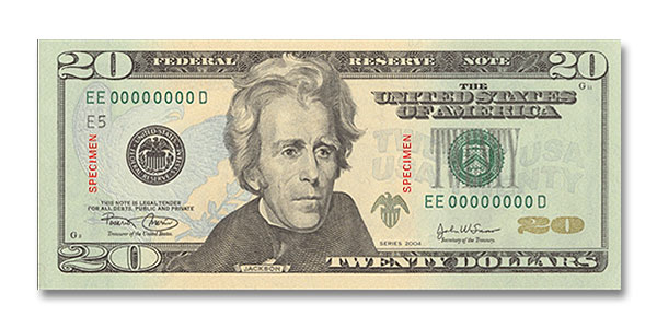
Went to the ATM at lunch and got my first stack of new US$20's. The new look wasn't a big surprise - bloggers have been writing about it and posting pictures of the new bill way before the October 9th rollout date.
But they're already counterfeiting the counterfeit-proof bills!
I am disappointed by how subtle the coloration is. You would think that if the US was going to redesign its money, it would use something flashy, patriotic...... why not something in red, white and blue? WHO decided that this pond-scum shade of green was the way to go in the first place? Other countries have *pretty* and FUN paper money. Why can't we?
posted by Anonymous at
10/23/2003 03:30:00 PM
![]()

0 Comments:
Post a Comment
Subscribe to Post Comments [Atom]
<< Home